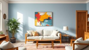
Did you know that 80% of kindergarten educators believe that the spaces we create are made special by the people within them? This sentiment is echoed in the design choices we make for our homes, particularly in Bulleen home painting. The impact of color in a living space goes beyond aesthetics; it can influence mood and create a sense of warmth and belonging. When selecting paint colors, it’s essential to choose shades that remain appealing over time, providing continuity in your design theme. In this article, we’ll explore the top 10 paint colors that never go out of style, ensuring your home maintains its charm and elegance regardless of evolving trends.
Key Takeaways
- Timeless paint colors can significantly enhance the ambiance of your home.
- Choosing classic color schemes helps maintain a cohesive design.
- Some colors have inherent qualities that contribute to their enduring popularity.
- Neutral shades offer versatility and a sophisticated background for any decor.
- Incorporating evergreen hues can refresh your space while keeping it classic.
- Strategic updates with timeless colors can bridge current trends and lasting appeal.
Understanding Timelessness in Paint Colors
Timelessness in color plays a crucial role in home design, influencing how spaces are perceived over time. Certain shades have proven their worth, continuously resonating with homeowners due to their versatility and lasting appeal. For instance, white paint stands out as the most popular option, known for creating a clean, bright, and airy atmosphere in any room.
Beige offers a classic, neutral vibe, earning its place as a warm and inviting choice for living spaces and bedrooms. On the other hand, gray has gained acclaim as a sophisticated option that adapts well to various decor styles, making it an enduring paint shade suitable for many settings.
Navy, often regarded as a timeless color, adds depth and richness to any area. It functions beautifully as both a neutral and an accent, allowing for creative expression in your design. Meanwhile, black introduces a dramatic flair, particularly effective in small doses or as an accent, bringing an air of sophistication to your home.
For those looking for vibrant options, red contributes bold energy and warmth, especially effective in dining rooms and kitchens. In contrast, blue offers a calming presence, perfect for bedrooms and bathrooms, appealing to anyone desiring serenity in their environment.
Green stands out as a refreshing choice, embodying a connection to nature and providing tranquility. This makes it ideal for bedrooms and living spaces alike. Additionally, taupe presents another warm neutral alternative, ideal for creating a cozy atmosphere in key areas of your home.
Terracotta, with its earthy tones, brings depth while harmonizing beautifully with organic or bohemian designs. As a result, these enduring paint shades significantly enhance the aesthetic appeal and functionality of your interiors.
Classic design elements, such as subway tiles, uphold their status in kitchens and bathrooms, owing to their historical significance and ageless beauty. Similarly, white kitchens endure in popularity due to their association with freshness, cleanliness, and spaciousness. Techniques like checkerboard patterns are making a comeback, blending nostalgia with sophistication and contributing to timeless designs.
| Color | Characteristics | Ideal Spaces |
|---|---|---|
| White | Bright, clean, versatile | Any room |
| Beige | Warm, inviting, classic | Living spaces, bedrooms |
| Gray | Sophisticated, timeless | Various decor styles |
| Navy | Deep, rich, versatile | Accent or neutral |
| Black | Bold, dramatic | Accent areas |
| Red | Energetic, warm | Dining rooms, kitchens |
| Blue | Calming, serene | Bedrooms, bathrooms |
| Green | Natural, refreshing | Living areas |
| Taupe | Warm, cozy | Bedrooms, living spaces |
| Terracotta | Earthy, warm | Organic designs |
The Importance of Choosing Classic Color Schemes
Selecting timeless hues for your home proves essential for achieving lasting appeal. Classic color schemes possess the unique ability to enhance design longevity, enabling you to create a space that feels both inviting and stylish for years to come. By opting for these enduring palettes, you benefit from a foundation that allows for simple updates over time.
Understanding color psychology helps you make educated decisions about your color choices. Different shades evoke emotions and affect perceptions of space. For instance, earthy tones like deep garden greens or rich dark browns impart a tranquil feeling, reminiscent of the natural world. Such selections not only offer beauty but also contribute to a calming environment.
Neutral shades, such as Light French Gray (SW 0055) and Alabaster (SW 7008), create versatile backdrops that pair well with various styles. Combining these classic colors can enrich your room settings, allowing personal touches without overwhelming the space. In contrast, bold color options, like navy or shades like Oyster Bay (SW 6206), evoke sophistication and serenity when balanced with softer hues.
Classic color schemes serve to transform your home into a haven of elegance. The right palette emphasizes aesthetic value while ensuring you enjoy a space that remains relevant regardless of fleeting trends. Investing time in selecting your color palette pays off when it comes to embracing both style and function in your living areas.
Paint Colors That Never Go Out of Style
When it comes to selecting paint colors that endure the test of time, several options consistently stand out. These enduring color palettes blend versatility and aesthetics, ensuring a lasting appeal across various design styles and preferences. Thoughtfully choosing from these timeless shades will enhance the interior of any space.
Defining Enduring Color Palettes
Enduring color palettes embrace a collection of shades that resonate well with a wide range of decor. Here are some colors that exemplify this concept:
- White – The most popular paint color choice, offering a clean and bright backdrop.
- Beige – A classic neutral that fosters a warm and inviting ambiance.
- Gray – Recently favored, this versatile color provides a sophisticated yet neutral option.
- Navy – A classic color that adds depth, perfect for accent walls or trims.
- Black – Utilized to infuse drama and sophistication into any space.
Why Some Colors Last Longer Than Others
Specific qualities enable certain colors to maintain their popularity throughout the years. Here are some factors contributing to the lasting appeal of these paint colors that last:
- Versatility – Colors like taupe and terracotta adapt beautifully to different settings.
- Calming Effects – Shades like blue and green create serene atmospheres, suitable for bedrooms and living areas.
- Classic Elegance – Complex cream shades like Benjamin Moore’s Feather Down provide timeless elegance that suits a variety of styles.
- Bold Accents – Vibrant colors such as red can elevate specific spaces when used thoughtfully.
The following table summarizes some of the most popular enduring color choices along with their notable qualities:
| Color | Notable Qualities |
|---|---|
| White | Bright and versatile, enhances space |
| Beige | Warm and inviting, excellent for cozy areas |
| Gray | Modern and sophisticated, pairs well with many colors |
| Navy | Deep and classic, adds a rich touch |
| Black | Dramatic and bold, great for accentuating features |
| Blue | Calming and refreshing, ideal for relaxation rooms |
Neutral Paint Colors: A Safe and Stylish Choice
When it comes to interior design, neutral paint colors provide a canvas that complements various styles and preferences. The allure of neutral shades lies in their ability to be adaptable, offering timelessness and a calming atmosphere in any setting. Embracing neutral tones not only enhances the visual appeal of a space but also delivers numerous interior design benefits.
Benefits of Neutral Colors in Interior Design
Neutral colors are revered for their flexibility and harmonious nature. Here are some key interior design benefits:
- Versatility: Neutral shades like Benjamin Moore’s Pale Oak and Revere Pewter fit seamlessly into any design scheme.
- Timelessness: Whites and soft grays like Dunn Edwards Swiss Coffee and Classic Gray maintain their fresh appeal over time.
- Enhancing Space: Lighter neutrals can make rooms appear larger and more airy, creating an inviting atmosphere.
- Creating Balance: Understanding undertones helps in choosing the right neutral paints, ensuring a cohesive look.
How to Incorporate Neutral Shades Effectively
Incorporating neutrals into your space can be done in various ways. Here are effective strategies for incorporating neutrals:
- Layering Textures: Combine different materials and textures with neutral paints to add depth.
- Accent Colors: Use vibrant accents against a neutral backdrop to showcase personal style.
- Lighting Consideration: Test paint colors in different lighting to understand how they shift throughout the day.
- Strategic Placement: Select neutrals such as Benjamin Moore’s Chantilly Lace or Sherwin-Williams’ Sea Salt for areas intended for relaxation.
Neutral paint colors like Hale Navy or Accessible Beige offer the sophistication of understated elegance. By making informed choices about these versatile shades, you can create a serene ambiance that reflects your unique style while enjoying the many benefits of incorporating neutrals into your home. These colors provide an exquisite backdrop that enhances not only your decor but also your lifestyle.
| Neutral Paint Color | Shade Description | Recommended Use |
|---|---|---|
| Pale Oak (OC-20) | Warm and versatile | Living rooms, bedrooms |
| Revere Pewter (HC-172) | Popular greige | Open spaces, kitchens |
| Chantilly Lace (OC-65) | Bright and crisp with undertones | Modern kitchens, bathrooms |
| Sea Salt (SW 6204) | Classic neutral with hints of color | Bathrooms, serene settings |
| Accessible Beige | Warm and inviting | Transitional spaces, open floor plans |
Evergreen Paint Hues for Every Room
When selecting paint colors, choosing evergreen paint hues can provide a lasting elegance that resonates across various spaces in your home. These colors are not only popular paint shades but also epitomize the characteristics of evergreen colors, offering warmth and adaptability. Below, discover the essential traits of these timeless paints and explore specific shades that can enhance your interior design.
Characteristics of Evergreen Paints
Evergreen paint hues stand out for several reasons:
- Timelessness: These colors endure shifting design trends.
- Versatility: They complement a range of styles and settings.
- Warmth: Many evergreen shades infuse spaces with inviting vibes.
- Nature-Inspired: They evoke a sense of tranquility and connection to the outdoors.
Popular Evergreen Shades to Consider
Integrating popular paint shades into your design can elevate any room. Here are some recommendations for those timeless, evergreen colors:
| Room Type | Suggested Shade | Highlighted Pairings |
|---|---|---|
| Kitchens | Forest Green (Greenfield SW 6439 by Sherwin-Williams) | Marble and Brass Finishes |
| Living Rooms | Creamy White | Blue Accents |
| Bedrooms | Muted Olive Green | Warm Walnut Wood |
| Entryways | Mint Green (Minty by Behr) | Natural Light |
| Office Spaces | Dark Charcoal | Light Blue Accents |
Interior Paint Colors with Staying Power
Choosing the right interior paint colors can significantly impact your home’s aesthetic and ambiance. Some colors stand out not only for their beauty but also for their staying power. These durable paint shades have remained in vogue, largely due to their versatility and ability to complement a variety of styles.
Features that Give Colors Durability
When assessing the staying power of interior paint colors, several features come into play. Key attributes include:
- Neutral Undertones: Colors with warm or cool undertones, like those found in Sherwin-Williams’ Creamy (SW 7102) or Benjamin Moore’s Swiss Coffee (OC-45), blend easily with different décor.
- Adaptability: The ability of a color to suit various spaces enhances its longevity. Farrow & Ball’s Hague Blue (No.30) is highly adaptable, making it a top choice for designers.
- Timelessness: Certain shades, such as Benjamin Moore’s White Dove (OC-17), have a classic quality that remains relevant despite changing trends.
- Compatibility: Colors like Sherwin-Williams’ Let it Rain (SW 9152) and Benjamin Moore’s Philipsburg Blue (HC-159) work seamlessly with diverse color schemes.
Examples of Popular Interior Shades
Below is a table showcasing some of the most dependable interior paint colors, recognized for their staying power and versatility:
| Brand | Color Name | Color Description |
|---|---|---|
| Sherwin-Williams | Pediment (SW 7634) | A sophisticated light neutral with warm undertones. |
| Sherwin-Williams | Greek Villa (SW 7551) | A cozy, versatile white suitable for both interiors and exteriors. |
| Sherwin-Williams | Let it Rain (SW 9152) | A captivating gray-blue hue perfect for multiple home atmospheres. |
| Farrow & Ball | Hague Blue (No.30) | Renowned for versatility across different spaces. |
| Benjamin Moore | Philipsburg Blue (HC-159) | Praised for its dependability and compatibility with many color schemes. |
| Sherwin-Williams | Creamy (SW 7102) | A tried-and-true favorite known for its subtle warmth. |
| Benjamin Moore | Revere Pewter (HC-172) | An elegant, inviting color for interior settings. |
| Benjamin Moore | White Dove (OC-17) | Acclaimed for its enduring appeal as a backdrop. |
| ECOS Paints | Prismatic Pearl (0025) | A design chameleon that adapts well to various lighting. |
| Benjamin Moore | Swiss Coffee (OC-45) | Lauded for its creamy white color with significant staying power. |

Ageless Paint Color Trends to Consider
As you explore ageless paint colors, understanding how these shades resonate with homeowners is crucial. Recent trend analysis showcases several timeless color choices that are gaining popularity for their versatility and enduring appeal. Designers consistently return to certain hues that adapt beautifully to contemporary home designs.
Chantilly Lace stands out for its ability to transition seamlessly into colorful secondary spaces, making it a favorite among decorators like Kara Miller. Similarly, Swiss Coffee offers a warm, classic aesthetic, praised by designers such as Caroline Brackett and Anna Franklin for its inviting qualities.
Gray Owl captures attention with its subtlety, providing a crisp, clean backdrop that allows furnishings to shine. Its popularity continues to rise, highlighting how white can maintain a timeless design without feeling stark.
| Color Name | Designer/Notable Use | Characteristics |
|---|---|---|
| Chantilly Lace | Kara Miller | Versatile for colorful spaces |
| Swiss Coffee | Caroline Brackett, Anna Franklin | Warm and classic |
| Gray Owl | Popular choice | Enhances furnishings against white |
| Soft Pink Shades | Maggie Bratton Dillon | Adds depth, complements different lighting |
| Card Room Green | Used in Atlanta home | Moody yet refreshing |
Muted blue-green hues, like those in a 1920s Nashville Tudor redesign by Catherine Branstetter, continue to resonate for their calming effects. Similarly, Laura Hodges embraced a dusty shade inspired by nature in the 2023 Idea House. In warmer climates, light pinks gain traction as they are embraced as neutrals, keeping interiors fresh, a trend highlighted by Palm Beach designer Ellen Kavanaugh.
Lastly, deep navy blue appears as a modern yet classic choice, ideal for creating bold statements in kitchens. This color offers an alternative to black, providing warmth and sophistication when paired with lighter accent colors. By considering these ageless paint colors, you can effectively implement a timeless design in your home that reflects both current trends and lasting appeal.
Updating Your Home with Timeless Paint Shades
Transforming your living space doesn’t always require a complete renovation. Updating colors through the selection of timeless paint shades allows you to refresh your home while maintaining enduring appeal. By strategically mixing trendy and timeless combinations, you can achieve a chic home decor that resonates with your personal style and is aesthetically pleasing for years to come.
How to Combine Trendy and Timeless Colors
Incorporating both trendy and timeless colors into your home design involves understanding how to balance these elements effectively. Here are some strategies:
- Choose a dominant timeless color. Colors like beige or classic navy can serve as the perfect backdrop for any room.
- Introduce trendy accents. Consider adding pops of more current colors like earthy greens or muted pinks through accessories such as throw pillows or art pieces.
- Utilize neutral tones. Shades like light gray and warm white complement virtually any color scheme, allowing for flexibility in design choices.
Strategies for a Chic, Current Look
To ensure your home reflects a chic and current look, consider these additional strategies:
- Invest in high-quality paint. Brands like Sherwin-Williams and Benjamin Moore offer vibrant shades that stand the test of time. For example, Sherwin-Williams’ Perfect Greige starts at $42.49, while Benjamin Moore’s Van Deusen Blue is priced at $52.99.
- Focus on accent walls. Using a bold color such as black or deep red for an accent wall can energize a space while maintaining a chic aesthetic.
- Embrace natural elements. Integrating calming colors like sage green or soft blues can create a refreshing feel, resonating well with nature and enhancing tranquility.
| Color | Category | Price Range (AUD) |
|---|---|---|
| Perfect Greige | Timeless Neutral | starting at $42.49 |
| Seaweed Salad | Trendy Green | $59.58 |
| Van Deusen Blue | Timeless Navy | $52.99 |
| Preference Red | Bold Accent | $115 |
| Light Gray | Timeless Neutral | $64 |
By focusing on updating colors in your home with a blend of trendy and timeless shades, you can cultivate a chic and inviting atmosphere while also considering long-term appeal. These well-balanced choices ensure your decor stays contemporary without sacrificing its timeless essence.
Colors to Make Your Home Feel Current and Fresh
Incorporating fresh paint colors into your home can significantly enhance its appeal while maintaining a sense of timelessness. Optimal color selection plays a crucial role in defining current home aesthetics, creating spaces that feel rejuvenated and inviting. Interior designer Rachel Ashwell emphasizes that selecting pale shades with gray undertones can sustain a fresh appearance for as long as 20 years.
To achieve a harmonious color palette, consider applying the 60-30-10 rule recommended by Erika Woelfel from Behr Paints. This method suggests that 60% of the main color covers the walls, 30% incorporates a secondary color for furniture or accents, and the remaining 10% decorates with accessories, creating a balanced, elegant look.
Utilizing ocean blue and silvery gray shades can evoke a tranquil atmosphere, reminiscent of coastal environments, as advised by designer Jason Grant. For a cozier feel, the trio of burnt orange, olive green, and taupey grays provides warmth, especially effective during the colder months. Fresh paint colors not only uplift the mood but also attract natural light, enhancing visual beauty.
When painting, it’s imperative to assess undertones of your color choices. Bright white combined with creamy white enhances dimensionality, forming a stunning backdrop for decorative elements. For various living spaces, interior brands like Benjamin Moore and Sherwin Williams offer a selection of trusted neutrals. For example, BM Swiss Coffee serves as a warm, sophisticated white, while SW Crushed Ice maintains a chic, gray appearance in open concept areas without veering towards purple

| Color | Type | Best Use |
|---|---|---|
| BM Pale Oak | Neutral | Main areas |
| SW Repose Gray | Calm | Kitchens, bedrooms |
| BM Gray Owl | Fresh | Living spaces |
| BM Classic Gray | Transitional | Bedrooms, common areas |
| SW Drift of Mist | Warm Gray | Small rooms |
Making mindful choices in color can breathe life into your interiors, aligning with modern tastes while still feeling comfortable and timeless. Earthy greens and pale neutral body colors with white trim offer warmth and charm, moving away from stark contrasts that may quickly date your spaces. Emphasizing personal expression through paint color choices ultimately leads to more fulfilling and enduring home aesthetics.
Conclusion
In closing, this article has provided valuable insights into the importance of selecting timeless paint choices that enhance your home decor for years to come. With trends continually evolving, focusing on enduring colors allows you to create spaces that maintain their appeal and style. The data shows a significant percentage of homeowners seeking no-fail paint colors, indicating a strong desire for durability and versatility in their design choices.
Throughout the exploration of various hues, from the soft creams of Benjamin Moore’s Cotton Balls OC-122 to the rich jewel tones that defined previous decades, you’ve seen how certain colors can look fresh and modern even when they reconnect us to past trends. These timeless selections not only influence the inherent style of your interiors but also contribute to a sense of warmth and invitation in your spaces as shown by ongoing public interest and favorable outcomes in homes painted with these shades.
If you’re contemplating a painting project, remember that utilizing a cohesive palette can greatly increase satisfaction with the results. Whether you lean toward sophisticated neutrals or earthy tones, the right paint choices can elevate your surroundings and provide paint durability for years. For expert advice on selecting the ideal timeless paint colors, consider reaching out to a reliable service like Prestige House Painting.