Did you know that the colors you choose to paint your home can affect your mood and overall well-being? Studies suggest that specific hues can evoke emotions, enhance creativity, or even induce relaxation. This makes Choosing the Right Paint Colors for your Home not just a matter of aesthetics but a pivotal element in transforming your living space into a sanctuary. In this comprehensive home painting guide, you will delve deep into expert painting tips that cater specifically to the nuances of Bulleen home decor.
By the end of this guide, you’ll be equipped with valuable insights ranging from color psychology, architectural considerations, to the latest trends, ensuring that your home reflects both your personality and functional needs.
Key Takeaways
- Understanding color psychology can enhance the mood of your spaces.
- Consider architectural styles when selecting your paint colors.
- Current trends in Bulleen offer a palette that resonates with local aesthetics.
- Utilizing paint samples under varying lighting helps find the perfect match.
- Exterior colors should complement the local environment and enhance curb appeal.
- Choosing the right finish is crucial for durability and maintenance.
Understanding Color Psychology
Color psychology plays a crucial role in shaping mood and atmosphere in your home. By carefully selecting paint colors, you can influence how you feel in each space. Different hues evoke distinct emotions, transforming an area from tranquil to vibrant. Understanding these psychological effects aids in creating an environment that enhances your daily experience.
How Colors Affect Mood and Atmosphere
Colors significantly impact paint colors and feelings within your home. For instance, soft blues and greens instill calmness and serenity, making them ideal for bedrooms and relaxation areas. In contrast, warm colors like orange and red inject energy and excitement, suitable for communal spaces like living rooms. Color choices can boost happiness, focus, or comfort depending on their application throughout your home.
Selecting Colors Based on Functionality
Functional color selection aligns colors with the intended use of each room. Consider using calmer shades in spaces meant for rest and rejuvenation, such as bedrooms or study areas. In more active settings, like kitchens or playrooms, brighter colors can foster engagement and energy. Professional services, such as those offered by Prestige Painters Bulleen, can provide invaluable insights into making the right choices for your specific needs.
Evaluating Your Home’s Architecture
When it comes to selecting paint colors, understanding your home’s architecture plays a crucial role. Different architectural styles not only define the appearance of a home but also suggest certain color palettes that enhance its visual appeal. Evaluating the unique features of your house allows you to make informed decisions regarding design style color matching that respects both aesthetics and historical significance, especially in a region rich in heritage like Bulleen.
Matching Colors to Design Styles
Each architectural style has its own charm and recommended color schemes:
- Craftsman-style homes often benefit from earth tones and subdued hues, creating a harmonious look that blends with natural surroundings.
- Victorian and Colonial homes tend to favor traditional palettes, including classic whites or creams complemented by vibrant accent colors that celebrate their historical essence.
- Modern designs typically gravitate towards minimalist shades like greys, blacks, and whites, giving a sleek and contemporary appearance.
When considering color choices, be mindful of how structural elements, such as roof material, interact with wall colors for a cohesive finish. This aspect is particularly relevant in Bulleen, where neighborhood aesthetics and local regulations can influence your options. Balancing standing out with blending in is key when choosing exterior colors.
Considering Historical Context in Bulleen
In Bulleen’s vibrant community, respecting the historical context of your home can enhance its value. Many homes in the area showcase distinct features from various eras, offering a unique opportunity for thoughtful design style color matching. Choosing colors that honor these historical elements while incorporating modern trends can yield stunning results.
Understanding how light affects color perception is essential. Testing paint samples on different sections of your home allows you to observe color behavior throughout the day. Seek advice from design professionals or experienced contractors to gain insights that align with local preferences. Ultimately, this careful approach will ensure a beautiful facade that resonates with Bulleen’s rich architectural tapestry.
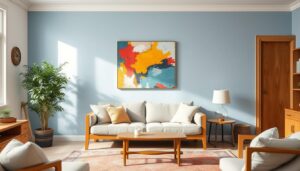
Choosing the Right Paint Colors for Your Home
Selecting the right paint colors for your space involves thoughtful consideration of various elements to achieve a visually appealing and harmonious environment. It is essential to create cohesive color schemes that flow well throughout your home while reflecting your personal style.
Creating Cohesive Color Schemes
When choosing paint colors, aim for a cohesive color scheme that connects the different areas of your home. Personal preference plays a vital role, so consider your tastes as the primary guide. Utilizing a mood board can assist in narrowing down preferred color palettes. Light colors tend to create a spacious and airy ambiance, while warm colors inspire confidence and energy, making them ideal for entertaining spaces. Think about how each color will interact with your existing furnishings and decor.
Accent Walls: Making a Statement
Accent walls present a fantastic opportunity to introduce statement colors without overwhelming the overall design. Select contrasting or complementary tones to draw attention to particular areas or features within a room. This approach adds depth and interest, allowing you to experiment with bolder colors in a manageable way. Remember to keep in mind the surrounding colors and existing decor to ensure a cohesive look across your home.

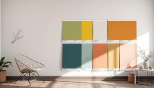
Trending Paint Colors in Bulleen
Staying current with the latest trending paint colors plays a vital role in enhancing your home’s visual appeal. In Bulleen, a variety of popular color palettes this year reflect the area’s natural beauty and local character. You can embrace softer shades and earthy tones that create a harmonious connection with the stunning surroundings, such as the picturesque landscapes near Yarra River and Banksia Park.
Popular Color Palettes This Year
This year’s popular color palettes in Bulleen feature a range of selections that cater to modern sensibilities. Among the most sought-after hues are:
- Sage Green
- Sandy Beige
- Crisp Whites
- Soft Greys
- Muted Pinks
These choices reflect the essence of natural hues that resonate deeply with the environment. You can effortlessly incorporate these shades into your home to create spaces that feel inviting and connected to nature.
Natural Hues That Resonate with the Surroundings
Adopting natural hues allows you to integrate your home seamlessly into the landscape. Shades like muted greens and soft browns echo the lush flora that surrounds Bulleen. This year’s local color trends emphasize comfort and simplicity, promoting a calming atmosphere throughout your living spaces.
Incorporating these popular color palettes Bulleen not only reflects your personal style but also enhances the overall aesthetic of your home. By choosing colors that resonate with the local environment, you create a cohesive and appealing space that stands the test of time.
| Trending Colors | Description | Ideal Rooms |
|---|---|---|
| Sage Green | A calming shade that brings a sense of tranquility. | Living Room, Bedroom |
| Sandy Beige | A warm neutral that creates a cozy ambiance. | Kitchen, Dining Area |
| Crisp Whites | Bright and airy, perfect for a fresh look. | Bathroom, Hallways |
| Soft Greys | Versatile and sophisticated, suitable for any space. | Office, Guest Room |
| Muted Pinks | A gentle hue that adds warmth and charm. | Nursery, Bedroom |
Utilizing Paint Samples Effectively
When embarking on the journey of selecting colors for your home, utilizing paint samples effectively is crucial. A thoughtful approach to testing can lead to better overall results. Begin by ensuring that you evaluate paint samples under various lighting conditions. The impact of lighting cannot be underestimated; colors may shift dramatically based on whether you’re in natural light, artificial light, or at different times of the day.
Testing Samples under Different Lighting Conditions
Testing samples is essential, as color perception changes with light quality. For optimal results, simulate the lighting conditions typical to your home:
- Natural sunlight: Observe colors throughout the day as they evolve.
- Artificial lighting: Assess how indoor lights affect your choices.
- Room orientation: Note that north-facing rooms often have cooler tones, while south-facing rooms can appear warmer.
Muting pastels were prevalent in the 1980s, a trend that can still be seen today. While testing samples, focus on a larger sample size for accurate visualization, ideally around 11″ x 17″. Drawing from items like area rugs or artworks can enhance your selection process, resulting in a more cohesive color scheme.
Understanding the Application Process
The paint application process plays a significant role in the execution of your chosen colors. Preparing the surface properly, using high-quality materials, and allowing adequate drying time can substantially influence the final appearance. Engage in the following steps to ensure success:
- Prepare surfaces by cleaning and priming.
- Utilize paint samples to apply colors directly on walls or poster boards.
- Consult professionals for larger sample boards, typically sized 11″ x 14″, providing a broader view of potential colors.
Choosing the right color can enhance your space, while the wrong color may disrupt the entire aesthetic. Keep in mind that while Home Depot offers free 8 oz. paint samples to limit store trips, companies like Samplize provide large peel-and-stick swatches for accurate color assessments. These tools streamline the process, making it easier to visualize how colors will manifest in your home.
| Lighting Condition | Color Perception |
|---|---|
| Natural Light | Bright and true representation |
| Incandescent Light | Warm and soft tones |
| Fluorescent Light | Cooler and more subdued hues |
| North Facing | Cooler, shadowed colors |
| South Facing | Warm and vibrant shades |
Exploring Interior Paint Colors
Selecting the right interior paint colors for your home can significantly influence both the aesthetics and functionality of each room. Understanding what colors work best in different spaces is essential for effective room-specific color selection. You may want to consider how each area serves its purpose when choosing shades, as well as your own personal style in home decor.
Choosing Colors for Different Rooms
Different rooms require different color palettes to enhance their respective atmospheres:
- Bedrooms: Soft, cool colors like pale blues and lavenders promote a calming environment.
- Kitchens and Dining Rooms: Warm colors such as reds and yellows stimulate appetite and encourage conversation.
- Living Rooms: Earthy tones like warm browns and muted oranges make for inviting and comfortable spaces.
- Small Rooms: Light colors and crisp whites create an illusion of more space.
Combining Personal Style with Practicality
Balancing personal style with practicality is vital for achieving a harmonious aesthetic. Consider the 60-30-10 rule in interior design, which suggests that a room should consist of 60% dominant color, 30% secondary color, and 10% accent color. This approach not only gives rooms a balanced appeal but also allows for your individual touches to shine through. When thinking about high-traffic areas, aim for paints that withstand wear and tear while complementing the overall design.
Collaborating with design experts can clarify your choices, making it easier to incorporate personal style in home decor while remaining functional. Additionally, utilizing paint samples can help you visualize different colors on your walls before settling on a final choice. Below is a summary table that showcases ideal colors for specific rooms.
| Room | Suggested Colors | Purpose |
|---|---|---|
| Bedroom | Pale Blues, Lavenders | Creamate a soothing environment |
| Kitchen | Reds, Oranges | Stimulate appetite and conversation |
| Living Room | Warm Browns, Muted Oranges | Create an inviting atmosphere |
| Small Rooms | Crisp Whites, Soft Pastels | Enhance the illusion of space |

Considering Exterior Paint Colors
When you think about selecting exterior paint colors, the paint resilience against weather and wear should rank high on your list of priorities. Choosing the right paint for your home is crucial in Australia, where the climate can be harsh. High-quality, durable paints not only enhance the look of your home but ensure longevity, keeping your investment protected from the elements.
Resilience Against Weather and Wear
Various factors play a role in the durability of your exterior paint, including the type of paint used and the application process. Popular options like Acrylate or 100% acrylic paints are known for their strong resistance to fading, peeling, and cracking. Working with experienced painters or color consultants can help ensure you select a product suited for your home’s specific conditions.
Colors That Enhance Curb Appeal
Engaging in outdoor color selection should reflect not only your personal style but also the character of your neighborhood. Observing existing house colors can influence your decision, ensuring that your home blends harmoniously with its surroundings. Driving around different neighborhoods offers a chance to gather inspiration from various exterior palettes. Classic neutrals like Monument or Surfmist, along with bolder hues like Jasper or Woodland Grey, can significantly aid in enhancing curb appeal.
Experts like Maria Killam emphasize the importance of coordinating window colors with the overall house scheme. Testing paint samples on small sections of your home’s exterior is crucial before making a final decision. Lighting conditions can change the appearance of colors, which is why this step can be transformative. Seeking advice from designers or friends may further enhance your color selection process, ensuring the chosen hues elevate your home’s aesthetic.
Understanding Paint Finishes
When choosing a paint finish, the options available can significantly influence both the look and longevity of your spaces. The paint industry offers various finishes, including flat, satin, semigloss, and gloss. Each type presents different levels of durability and aesthetic appeal, making the process of selecting the right finish essential for any home project.
How to Choose the Right Finish for Your Project
Choosing paint finish involves understanding how each type affects the appearance and function of a room. For example:
- Flat finishes: Ideal for low-traffic areas like bedrooms and ceilings. They effectively hide imperfections, though they may not withstand heavy wear.
- Satin finishes: More durable than flat paints, satin finishes are suitable for medium-traffic areas such as living rooms and hallways.
- Semigloss finishes: Recommended for areas needing frequent cleaning, such as kitchens and bathrooms, these finishes provide exceptional durability.
- High-gloss finishes: Offering the highest level of sheen and durability, this finish is ideal for furniture and trim, helping to accentuate architectural features.
Consider the function of each room when selecting your paint finishes. For instance, moisture-resistant semigloss or high-gloss finishes work best in kitchens and bathrooms, while softer, low-sheen finishes create inviting atmospheres in bedrooms.
Durability and Maintenance Considerations
The durability of finishes plays a crucial role in long-term maintenance considerations. Different areas of your home require different levels of resilience:
| Room Type | Recommended Finish | Durability |
|---|---|---|
| Bedrooms | Flat or Eggshell | Low |
| Living Rooms | Satin | Medium |
| Kitchens/Bathrooms | Semigloss or High-Gloss | High |
| Wood Furniture | Satin or Semigloss | Medium to High |
Ultimately, your choice of paint finishes will influence not only the décor but also the upkeep. High-traffic areas benefit from durable finishes that withstand frequent cleaning, while aesthetic considerations can guide options for less-frequented spaces.
Conclusion
In the journey of choosing paint colors for your Bulleen home, you’ll discover the transformative power of color psychology, architectural considerations, and current design trends. A well-considered palette not only enhances the aesthetics of your space but also aligns with the mood you wish to evoke. By applying expert painting tips such as testing samples in different lighting, you can create a perfect atmosphere tailored to your needs.
Home transformation begins with understanding how colors like calming blues and greens can foster relaxation in bedrooms, while vibrant yellows and dynamic reds invigorate kitchens and living areas. Classic hues such as creamy white and earthy green not only brighten up spaces but also connect your home to nature, promoting a sense of rejuvenation.
For a smoother process, engaging professionals such as Prestige Painters Bulleen can provide valuable insights and ensure high-quality finishes, adapting styles to suit your lifestyle. As you reflect on your choices, remember that the right paint colors elevate your home’s personality and functionality. For additional support, reach out to Prestige Painters at 0466 344 447 or via email at info@prestigehousepainting.com.au.