Did you know that approximately 60% of blog photos are captured in white rooms, capitalizing on ideal lighting conditions? While the all-white trend might look stunning in online posts, it isn’t always practical for your home’s interior. This article delves into the drawbacks of opting for white walls across various spaces, revealing why they might not be the best fit for you.
Interior design trends continuously evolve, yet the allure of white walls persists. They’re often associated with elegance and minimalism, yet many professional designers caution against this choice due to its potential pitfalls. From color psychology to room functionality, understanding the implications of white walls reveals that they may not always enhance your room ambiance, as you might expect.
By exploring the interplay of natural lighting, color psychology, and room functionality, this article will guide you in reassessing the decision to use white walls throughout your living spaces. You’ll learn what alternatives can better complement your home while still adhering to modern design principles.
Key Takeaways
- 60% of blog photos use white rooms for better lighting.
- Professional designers often recommend against all-white walls.
- Natural lighting affects the appearance of white walls significantly.
- Trends are shifting towards warm tones in interior design.
- White walls can create a sterile feel without added texture.
- The choice of white shades impacts the overall aesthetic.
Introduction to the All-White Trend
The all-white trend has surged in popularity among interior design enthusiasts. This trend is characterized by an unwavering commitment to minimalist aesthetics, creating spaces that evoke a sense of simplicity and cleanliness. Many homeowners appreciate the brightening effect white can bring, making rooms appear more spacious and open. Nevertheless, it is essential to recognize that such a palette may not be suitable for every room, shaped by the unique characteristics of the space, variations in lighting, and personal design choices.
While white remains a favorite in contemporary decor, striking a balance in color usage creates a more dynamic environment. For instance, incorporating accents through colored decor can enliven an otherwise stark room. Items like artwork, textiles, or decorative objects introduce personality, ensuring spaces feel welcoming and inviting. Likewise, blending different shades of white can add depth, preventing rooms from feeling flat or uninviting.
Exploring alternatives to the all-white trend allows for more creative freedom and expression in home design. As trends shift, so does the emphasis on the need for personalized touch. The embrace of colors beyond white indicates a growing preference for more vibrant and engaging environments that reflect individual styles while maintaining a sense of harmony and balance. Emphasizing the significance of tailored design choices fosters spaces that resonate with the unique lifestyles of their inhabitants.
Understanding Color Psychology in Interior Design
Color psychology plays a vital role in influencing the mood and ambiance within your living spaces. Different hues can evoke specific emotional effects of color that resonate with how you want to feel in a room. Understanding this concept helps you make informed design choices that align with your lifestyle and preferences.
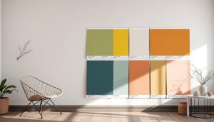
For instance, orange exudes warmth, enthusiasm, and creativity, making it a fantastic choice for energizing areas like kitchens and bathrooms. Yellow, often linked with joy and positivity, creates an uplifting atmosphere, but caution is advised as an all-yellow interior may lead to frustration.
Green promotes a sense of calm and balance, especially when paired with earthy tones like brown. This color evokes feelings of emotional safety, perfect for creating restful retreats. Blue, a popular choice for bedrooms and bathrooms, instills tranquility and trust, contributing to an overall serene environment.
White symbolizes cleanliness, often seen in healthcare settings, conveying purity and safety. While it brings spaciousness, its lack of warmth may sometimes lead to a cold atmosphere. On the opposite spectrum, black introduces sophistication and power, enhancing the elegance in your home décor.
Colors like red stimulate conversation and can leave a strong impression, making it a powerful option for social spaces. Pink, on the other hand, infuses a playful warmth, though it can feel overly sweet when overused.
Choosing the right colors relies heavily on understanding these emotional effects of color. By identifying how specific colors align with your desired moods, you can create spaces that enhance your overall well-being.
| Color | Emotional Effects | Ideal Spaces |
|---|---|---|
| Orange | Enthusiasm, warmth, creativity | Bathrooms, kitchens |
| Yellow | Happiness, positive energy, optimism | Living areas |
| Green | Calmness, balance, harmony | Rest areas, bedrooms |
| Blue | Tranquility, trust, wisdom | Bedrooms, bathrooms |
| White | Cleanliness, purity, safety | Healthcare settings, minimalistic designs |
| Black | Sophistication, power, elegance | Dining areas, accent walls |
| Red | Stimulates conversation, strong impression | Social rooms, dining areas |
| Pink | Playful, feminine warmth | Children’s rooms, social spaces |
| Purple | Luxury, creativity, drama | Accent walls, creative spaces |
The Impact of Natural Lighting on Room Ambiance
Natural lighting plays a vital role in shaping the overall room ambiance. The way light enters and interacts with wall colors can enhance or diminish the aesthetic value of any space. Understanding these wall color effects allows homeowners to make informed decisions regarding their interior designs.
How Lighting Influences Wall Color Appearance
The quality and quantity of natural lighting directly affect how wall colors are perceived. In bright rooms, walls painted in white can appear more vibrant and inviting, creating an airy atmosphere. Conversely, in dark rooms, white walls may feel cold or sterile, leading to what some refer to as the white wall dilemma.
Bright vs. Dark Rooms: The White Wall Dilemma
When contemplating wall colors, it’s important to consider the specific lighting in each room. Spaces that receive ample natural light can thrive with white walls, enhancing their brightness and charm. On the other hand, rooms lacking natural light might benefit from warmer, bolder hues that promote a cozy and inviting feel. Evaluating the natural lighting conditions in your home, alongside the intended use of each space, is essential for achieving the desired room ambiance.
Room Functionality and Purpose
Understanding the relationship between color and room functionality plays a key role in interior design. Each room serves a specific design purpose, and selecting the right color can significantly enhance its overall utility. You can create a space that better fulfills your needs by considering how color choices impact room usage.
How Different Spaces Require Different Colors
Different spaces within a home require distinct approaches to color selection. In rooms intended for relaxation, such as bedrooms, softer hues promote calm and tranquility. Conversely, vibrant colors in kitchens or dining areas can energize the environment, inspiring activity and fostering social interaction. Here is a brief overview of how various colors align with specific room functionalities:
| Room Type | Recommended Colors | Color Significance |
|---|---|---|
| Kitchen | Bright yellows, oranges, greens | Enhances energy and stimulates appetite |
| Bedroom | Soft blues, greens, and lavenders | Promotes relaxation and restful sleep |
| Living Room | Warm neutrals, earthy shades | Creates a cozy atmosphere for socializing |
| Home Office | Cool blues and greens | Increases focus, creativity, and productivity |
Utilizing Colors to Enhance Room Use
Color enhancement can greatly improve room functionality. For small spaces, lighter shades tend to create an illusion of openness, making them feel more expansive. In contrast, deeper colors can make larger rooms feel cozier and more intimate. As you consider different colors, think about how they can cater to the practical needs of your various rooms.
Keep in mind various design techniques that incorporate color for functionality improvement:
- Choose lighter shades for rooms you want to feel larger.
- Opt for darker tones in expansive areas to foster warmth.
- Use bold accent colors to energize specific locations, enhancing their utility.
- Consider the impact of natural lighting on your room’s color; it can significantly alter the appearance of hues.
Why White Walls Aren’t Always the Best Choice for Every Room
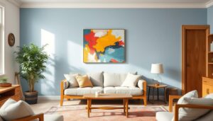
The allure of white walls often stems from their association with a clean, modern aesthetic. Yet, the disadvantages of white walls are significant, especially when considering room-specific decor. While a stark white space can appear serene, it can also feel cold and uninviting. The architectural details in your home may get overshadowed in an all-white scheme, detracting from the unique features that bring character to your space.
Choosing white as the predominant color might be driven by current trends rather than personal preference. In the aftermath of events like September 11 and the 2008 stock market crash, gray emerged as a predominant paint color. Its versatility allowed for both warm and cool tones, making it a preferred choice for many. The current shift away from cooler grays indicates a declining popularity, leading many homeowners back to the allure of white.
Real estate trends reveal a movement away from gray interiors, with professionals increasingly favoring white for its ability to complement trendy accessories and houseplants. Affordable, design-forward furnishings have made it easy for homeowners to refresh their spaces. While white can make elements pop, it often requires careful coordination with furnishings to avoid a stark, sterile look.
The selection of the right shade of white is crucial for achieving the desired effect. Stark white walls may demand an abundance of white furnishings to create a cohesive ambiance. Otherwise, the room may appear unfinished or unintentional. On the other hand, complex creams can enhance warmth and depth, creating a more inviting environment.
Additionally, white walls may limit your options for trim color throughout the house. This limitation can lead to unexpected costs when repainting spaces in the future. With the belief that white lacks versatility, it is essential to consider the specific characteristics of each room before making a decision.
| Aspect | White Walls | Alternative Options |
|---|---|---|
| Versatility | Less versatile, often requires specific decor | More adaptable, allows for various decor styles |
| Aesthetic Perception | Can feel cold or sterile | May appear warmer and more inviting |
| Natural Light Requirement | Requires ample natural light for effect | Can function well in different lighting conditions |
| Impact on Architectural Details | Can overshadow distinctive features | Highlights architectural elements effectively |
| Limitations on Future Choices | Can limit trim color options | Allows for more cohesive color schemes |
Understanding the disadvantages of white walls in various contexts empowers you to make more informed decisions tailored to your living spaces. Taking into account elements like architecture, color coordination, and personal style will lead to more satisfying interior design outcomes.
The Role of Accent Walls in Interior Design
Accent walls serve a vital purpose in interior design, breaking up the monotony often associated with all-white rooms. These walls provide an opportunity to introduce color and personality without overwhelming the space. By integrating different design features, accent walls enhance visual interest and create a focal point that draws the eye.
Many experts believe that a well-executed accent wall can transform a room significantly. The advantages of using accent walls include creating a unique style that helps define spaces, offering a distinctive flair among similar properties, and cleverly distracting from less desirable areas. These characteristics mark accent walls as valuable tools in modern design.
Despite their benefits, there are potential drawbacks to consider. A poorly executed accent wall can detract from a room’s overall charm. Risks include falling into overly trendy designs and facing challenges when attempting to remove certain materials like wood or stone. Nevertheless, painted accent walls remain a popular choice due to their accessibility, allowing homeowners to start with a loved color experiment.
Various styles of accent walls exist, each contributing differently to the ambiance of a room. Wood molding accents offer a classic appeal, ideally matched with neutral tones for a timeless look. Meanwhile, wallpapered walls can add personality but present removal challenges, especially on textured surfaces.
Incorporating floor-to-ceiling gallery walls or utilizing drapery panels can effectively enhance visual interest without significant renovations. For a rustic touch, wood finish accent walls, such as reclaimed wood, can complement a home’s style while avoiding a cluttered appearance. Conversely, stone and brick accents lend a vintage flair, but caution is advised to ensure they align with existing decor.
When planning accent walls, intentionality is crucial. A well-placed accent wall featuring complementary colors can markedly enhance a room’s aesthetic. Experts recommend considering neutrals for a subtle touch and limiting the number of accent walls to maintain balance. Remarkably, accent walls remain fashionable in 2023, indicating their durability in the evolving landscape of interior design.
| Type of Accent Wall | Advantages | Disadvantages |
|---|---|---|
| Painted Walls | Cost-effective, easy to change | Can feel overdone, requires careful color selection |
| Wood Molding | Classic look, adds depth | Can clash with overly modern decor |
| Wallpapered Walls | Variety of styles, adds pattern | Difficult to remove, can overwhelm small spaces |
| Gallery Walls | Personalized, low-impact installation | Requires ongoing updates to remain fresh |
| Drapery Panels | Soft appearance, functional | May limit furniture placement options |

Complementary Colors: Creating Visual Interest
Integrating complementary colors can transform your space, adding depth and personality while ensuring your decor choices remain visually appealing. Understanding how colors interact is foundational to achieving a coordinated design that captivates the eye. Complementary colors enhance your decor, making a bold statement against the backdrop of white walls with color.
Choosing the Right Colors for Your Decor
Selecting appropriate colors is essential in creating a harmonious environment. You can use various tools, such as color wheels, to identify colors that complement each other. For instance, pairing rich blues with golden yellows can create vibrant energy, perfect for a lively living room or kitchen. Complementary colors not only enliven your decor choices but also function to evoke emotions, making each room feel purposeful.
Balancing White with Vibrant Hues
When working with white walls, balancing color schemes becomes crucial to avoid starkness. To achieve this balance, consider incorporating vibrant hues in accessories, artwork, or furniture. Accents like greenery or textured textiles can soften the impact of brightness while enhancing visual interest. Choosing furnishings in soft pastels or bold primary colors can enliven spaces dominated by white, creating a more inviting atmosphere.
The Importance of Texture and Paint Finishes
Texture in interior design plays a crucial role in enhancing the visual appeal of any space. It adds depth and interest, breaking the monotony often associated with flat surfaces. Different paint finishes—whether matte, satin, or gloss—bring distinctive characteristics to walls, influencing how a room feels and looks.
When opting for paint finishes, consider the functionality of the room. High-traffic areas may benefit from more durable choices like eggshell or satin, which resist scuffs and are easier to clean. While flat paints cover imperfections beautifully, they can lead to frequent touch-ups and eventual repainting. This can add to the frustration and costs over time.
- Flat: Ideal for low-traffic areas, offers a soft and cohesive look.
- Satin: Provides a subtle sheen while remaining durable, making it a practical option.
- Gloss: High shine, great for accents, but may show imperfections more readily.
Different finishes create unique effects, transforming an ordinary room into something remarkable. For instance, walls painted in a soft satin finish can reflect light differently, creating a warm and inviting atmosphere. This is especially important in spaces where natural light fluctuates throughout the day.
Incorporating a mix of textures and finishes can result in an environment that feels both vibrant and cohesive. The use of layered colors, such as the various shades of white added to walls and trim, can help establish dimension, making even simple setups feel more complete. This approach aligns beautifully with the notion of creating depth and interest through paint choices.
Interior Design Trends: Moving Beyond White
Contemporary interior design emphasizes diversity, pushing the boundaries of traditional aesthetics. As you explore modern design trends, you’ll witness a significant shift towards vibrant colors, patterns, and textures. This color movement aims to create inviting environments that reflect individuality, stepping beyond whites that often dominate contemporary décor.
Recent surveys reveal that many outdated trends are falling out of favor. For example, glass splashbacks featuring solid colors like purple or peach, once trendy, now feel dated. A similar fate befell popcorn ceilings, with their widespread use from the 1960s to the 1980s. Consumers increasingly prefer fresher alternatives that add warmth and character, making it easy to see why the trend of neutral palettes anchored heavily in white is being reconsidered.
In contrast to these past preferences, elements like wavy and scalloped shapes, vintage designs, and richer color choices have emerged as captivating trends. This vibrant shift, especially pronounced after the COVID-19 pandemic, allows for personalized spaces that offer a welcoming atmosphere. Considerations for color drenched rooms replace the singular accent wall approach that has grown outdated.
This re-evaluation of color extends into neutral schemes, where shades such as pale grey, cream, and caramel facilitate a softer ambiance. The Grounded palette from the Dulux 2020 Color Forecast incorporates earthy tones like muddy lavender and pale biscuit. These options create a calm environment without resorting to sterile white walls.
Texture plays an important role in these redefined neutrals. Integrating natural elements, such as honeyed timbers and linen, adds depth, inviting tactile experiences not found in minimalist designs. The focus on these elements reaffirms that true warmth and interest in design rely on more than just color; they encompass the relationship between texture and hue.

| Outdated Trends | Emerging Trends |
|---|---|
| Glass splashbacks in purple and peach | Textured wall finishes like limewash paint |
| Popcorn ceilings | Wavy and scalloped shapes |
| Excessive grey tones | Warm, inviting colors such as sage green and terracotta |
| One-wall wallpaper | Color drenched walls for immersive design |
| Neutral schemes anchored in white | Pale grey, cream, and caramel neutrals |
Personalizing Your Spaces with Color
Creating personalized spaces allows you to reflect your unique style through effective paint choices. Utilizing color as a storytelling medium not only defines the ambiance of a room but also establishes a connection with its inhabitants. By thoughtfully considering your options, you can transform any area into a representation of your personality.
How to Reflect Your Style through Paint Choices
The hues you select for your walls play a significant role in shaping the atmosphere of your living space. For instance, painting the walls and ceiling the same color can enhance the perception of space, making rooms appear bigger. Light-colored schemes often evoke an open, airy feeling, perfect for brightening small or darker areas.
On the other hand, dark-colored paint creates a cozy and intimate atmosphere. This choice works well in rooms designed for relaxation, such as bedrooms or reading nooks. Implementing varying tones within a monochromatic scheme allows for a sophisticated touch while disguising imperfections in walls and ceilings.
Consider using consistent colors throughout your home for a cohesive design. Boldly colored walls have recently become a trend, moving away from the prevalent white walls that tend to dominate. While white reflects light and feels fresh, it may not be the best option for expressing personal taste.
Remember that paint choice serves as a style reflection for you and your preferences. Experimenting with warm tones or opting for contrasting wall panels can create visual interest and contribute to the overall ambiance of your personalized spaces.
Conclusion
Throughout this article, we have explored why white walls, while popular, do not serve as the ideal choice for every room. The journey through various color options reveals the versatility and importance of making informed interior design decisions. By considering factors such as room functionality and desired ambiance, you can significantly enhance your living spaces with an effective use of color.
Kristi’s experience illustrates the challenges many face when trying to find the perfect hue. From the lifeless flat white walls of her condo to the energizing light green of Feng Shui, it’s evident that the character and livability of a home are deeply influenced by thoughtful color choices. As trends shift toward bolder colors, there is a compelling argument for reflecting your style and creating a space that truly resonates with you.
Ultimately, the key takeaway is that color has the power to transform your environment. Whether you opt for vibrant shades or consider neutral tones with added depth, remember that your interior design decisions should stem from a personal connection to the spaces you inhabit. Embrace the journey of exploration in color and design to create a home that feels uniquely yours.